
Tips for Excel, Word, PowerPoint and Other Applications
Scorecards in Excel
Why It Matters To You
Scorecards are a great way to translate a metric (sales vs. target, performance ratings vs. a peer group, actual costs vs. forecast, etc) into a standardized scale for easy understanding. In addition to the score, you can add bells and whistles such graphs, fonts, shading, etc to graphically highlight "good" or "bad" results. The trick is making the scoring and associated bells and whistles formula-based so that everything drives off the raw metric. After all, everything really is based off the raw metric, so there is no reason why the scorecard shouldn't follow the same rules.
How To ...
Here's a quick example of what we might want to do with our scorecard. Based on sales for the period vs. a target, we want to assign a score of 1-13, show an indicator whether it's at, below or above goal, and shade the corresponding score box. All of this can be done with formulas.

While the output looks simple enough, it's going to use a combination of a several things we've talked about in the past: Introduction to VLOOKUP, Conditional Formatting: Cell Value Is, Conditional Formatting: Formula Is, and Using the Character Map. You can also download the example file, scorecard_example.xls to look at how I put each element together.
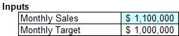
In this example, we really only have 2 inputs which will drive everything else. In the example file, you'll see two cells that you can play around with. Realistically, the only one that should change is the Monthly Sales figure since that is the metric that's being reported against. The target, is really a static assumption. That can change, but probably won't without good cause.
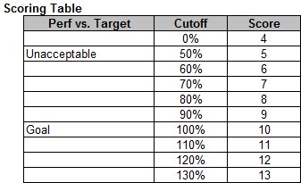
The next element we need to set up is our scoring table. This will translate our performance vs. goal metric into a standardized 4-13 point scale. While you could use a different scale for each metric, it's nice to use a single standard, so that anyone looking at a series of 10's knows they all mean the same thing -- hit 100% of the target.
We're going to use a VLOOKUP without exact match. We're not using exact match because we want a range of performance vs. goal. So, everything from 100% to 109.9999% maps to a score of 10. Three notes. First, if we aren't seeking exact matches, then you'll remember that our list needs to be sorted in ascending order. Second, if we see exact matches, then our scoring formula will return errors in all cases unless we happen to hit 100%, 110%, etc exactly on the nose. Lastly, we have to start the scale at 0%, so that Excel returns something, in this case, as score of 4, which is our catch all. If we don't start the scale at 0% and use 40% for example and for some reason that month is really poor (35%), the formula will fail because it can't find a value less than or equal to 35%.
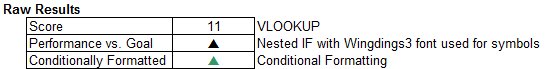
Now that we have our metric score, we can start doing creative things with it. In the next example called Raw Results, I've done 2 things. First (row 22), I've used a nested IF with a change of font to translate performance at goal, below goal, or above goal into trianges. If you look at the example file, you'll see the nested IF simply returns a value of p, q, or n, which happen to map to a set of triangles and arrows in the Wingdings 3 font set. See the Character Map tutorial to find out more about how to use different fonts.
The next thing I've done (row 23) is to add Conditional Formatting to color code the resulting arrow depending on whether it's a p, q, or n.
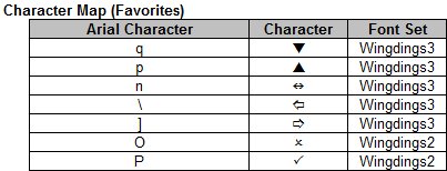
For reference, here are the characters I've used, and some other favorites, and how they map to the standard letters and symbols.
Once again, here's what it all looks like when it's all be put together. The blue shading is another application of conditional formatting, this time base on Formula Is
Notes
| Last updated | 3/3/08 |
| Application Version | Excel 2003 |
| Author | Michael Kan |
| Pre-requisites |
Introduction to VLOOKUP Conditional Formatting: Cell Value Is Conditional Formatting: Formula Is Using the Character Map |
| Related Tips | None |